As some of you may know I have been working on the small apartment space for the past few weeks, and will continue to do so for a while yet. You can see the whole series on the bottom of this post.
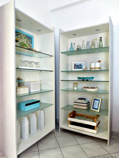
So far, I shared with you how I painted the bookcases with milk paint. The photos in that post were styled to show off the two bookcases. Pretty pictures but not reality. And certainly not practical!
Today I will be sharing the reality photos of the bookcases. What it actually looks like and what I have done to make it functional.
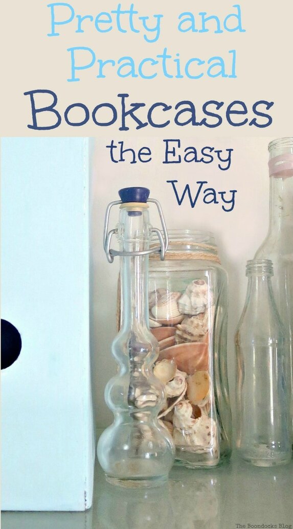
Pretty and practical bookcases the easy way, because we don’t want thing to be too hard!
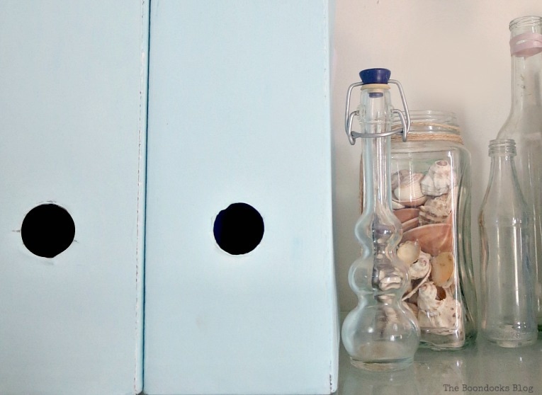
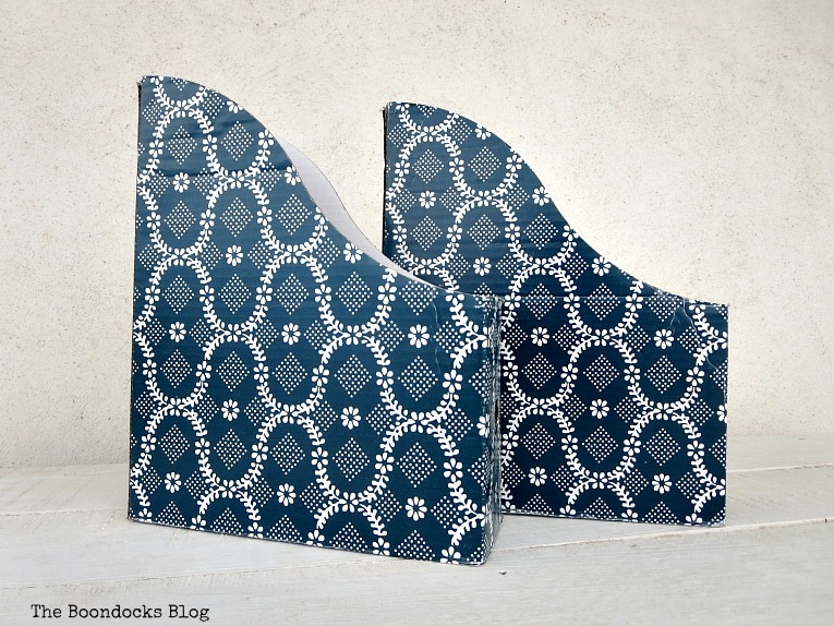
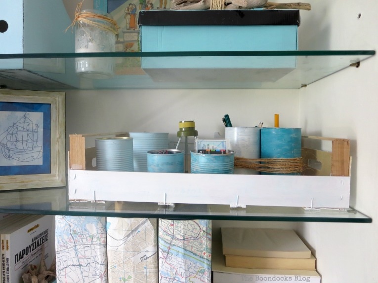
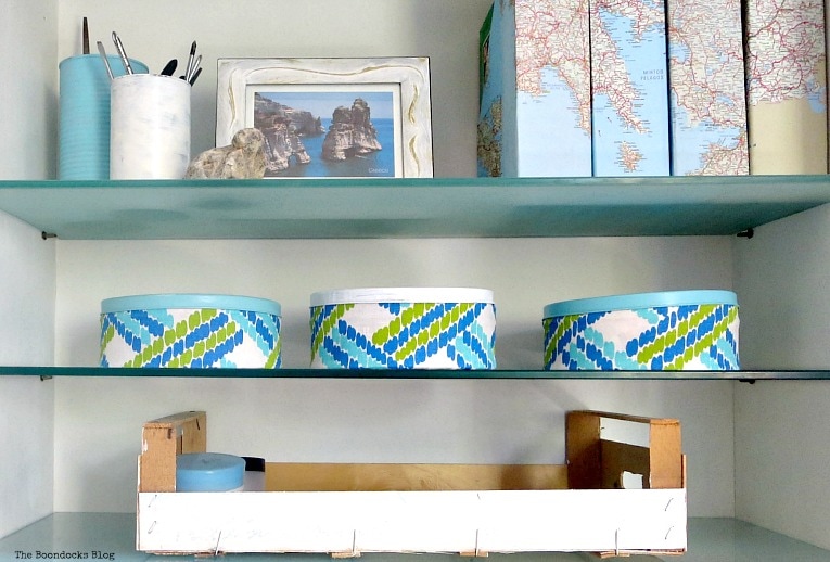
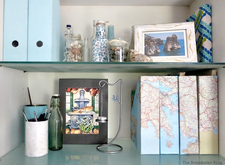
In our home we have lots of magazine files. They are easy to use for storage and organization. However the ones I had from Ikea, were dark colors and not in keeping with my new bright and cheerful philosophy for the look of the new space.
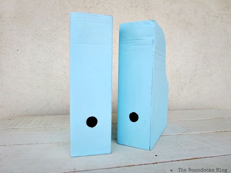
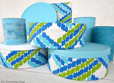
What did I do to add bright and cheery? Why I painted them of course! Why not? A little chalky type paint can go a long way and easily transform these dark magazine files into blue stunners. I simply mixed in a little white with the blue paint color I already had. (If you’d like to see which products I recommend, I have an affiliate link below.)
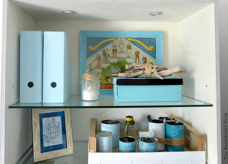
Below you can see where I have placed a few of them. Had I kept the original look it would have been too dark and created a very busy bookcase. Now I have pretty plus practical.
And the tins were all painted with similar colors to create a bright and cheerful look.
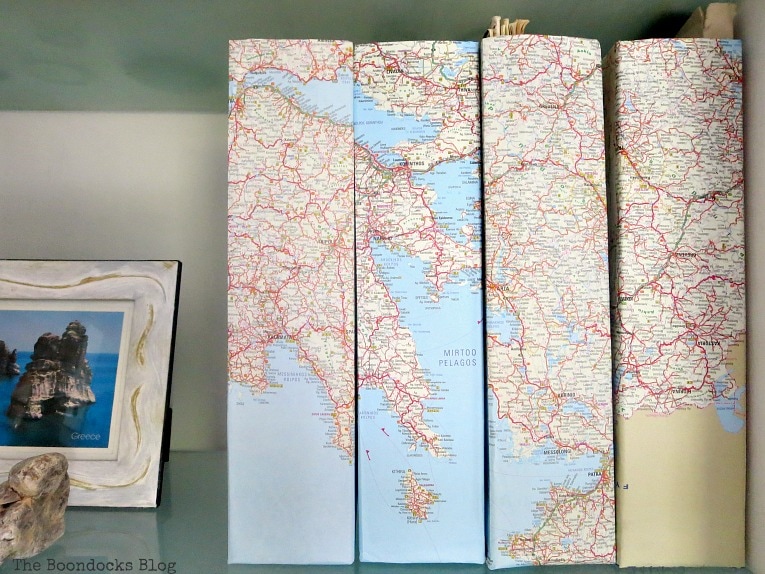
As we move down the first bookcase we see more magazine files which have been decoupaged with maps. In this case they are New York maps. I use them for holding paperwork, files and also random receipts. We are very big here in Greece on collecting receipts. “wink”
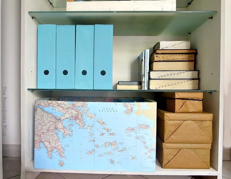
On the bottom of the first bookcase I have a strawberry crate which was painted white. And a big cardboard box. The pattern will of course be familiar to many of you. I decoupaged the box with this fabric to give some unity to the area.
You can also spot my Empire State building wood pieces. They were pieces of wood that were found out on the road. I believe they may have been legs to something. But I think they look like my beloved Empire State Building and so I use them as decor.
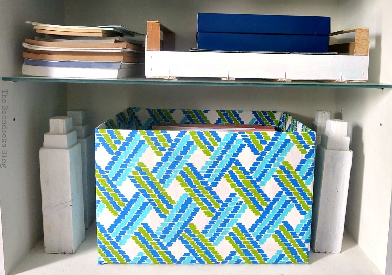
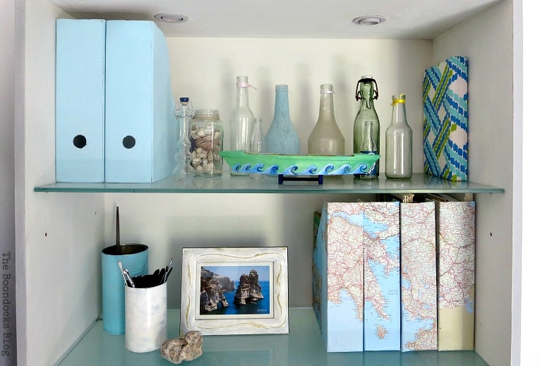
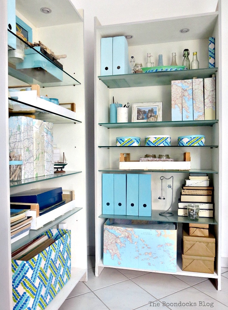
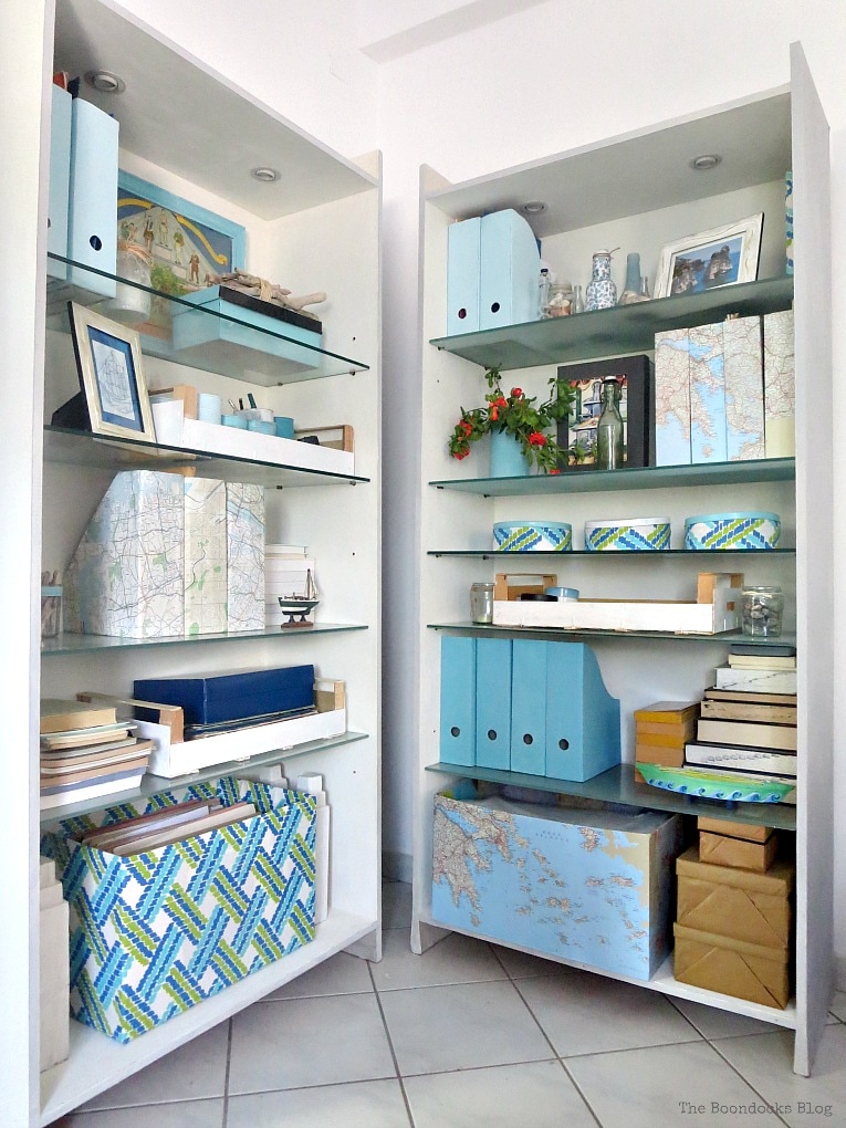
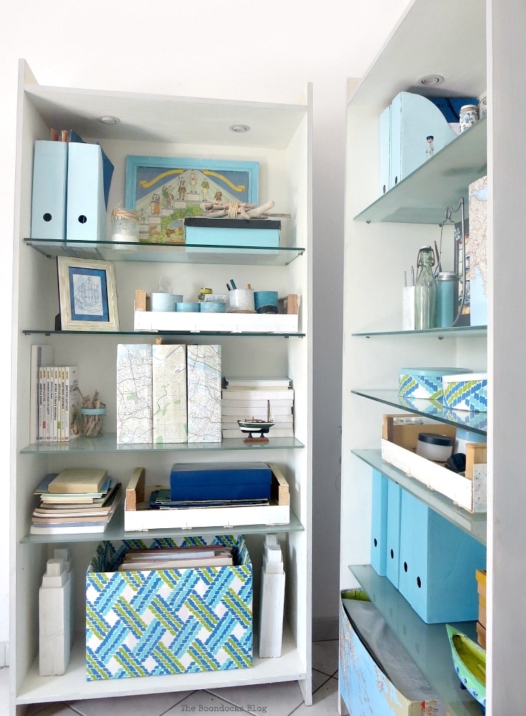
And moving onto the second bookcase. The top area has more magazine files in blue and in map decoupage. There’s that fabric again! This time on a phone book.
More maps, this time of Greece and the Aegean Sea. Can you see the blue that is sprinkled throughout?
The magazine files you see next to the books are a darker shade of blue than the previous ones. I wanted to mix things up a bit. And below them, another box, this time decoupaged in… you guessed… it maps!
Disclosure: The items below are affiliate links and link to Amazon.com. If you purchase any of these products through the links, I receive a small commission, that way I can continue to provide you with lovely content. There is no extra charge to you for purchasing through my affiliate links.
I managed to create a variety of colors, textures and patterns but all within the same soft blue scheme. I wanted it to be relaxing and calming. So that when my tired eyes rest on it, I won’t get a headache. I think that the gray and white paint job of the bookcases also adds to the overall calm effect. Pretty and Practical!
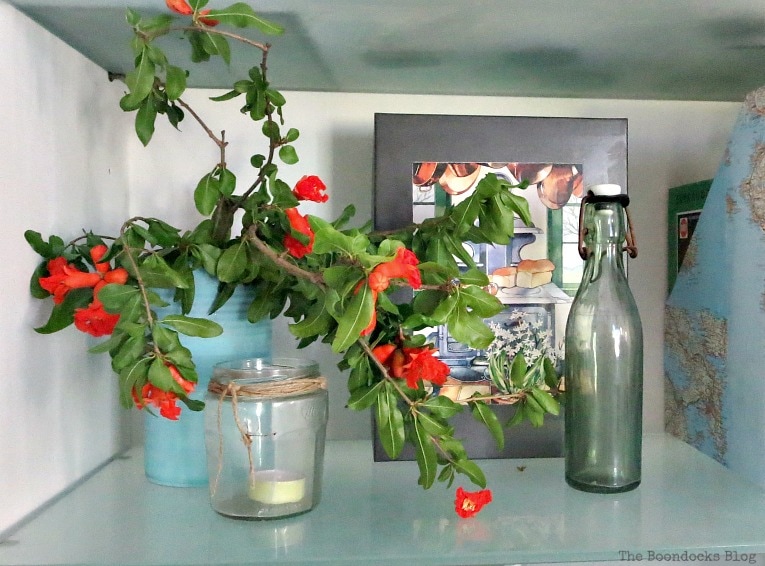
I was all done but then I found a gray box. See it next to the mapped files? I liked it so much I glued on an image from a calendar I had. Yes, I keep old calendars from years gone by for their pretty images. Am I bordering on hoarder status?
Does it look nice with the orange or is it too much?
And the simpler version!
So you can see I’ve been able to create lots of storage space frugally. What did I use? Old magazine files I already had and a few cardboard boxes. With a little imagination and creativity, and a bit of paint, fabric and mod podge I have given the bookcases a unified look while at the same time giving myself lots of storage. Upcycling at it’s best!
I hope that I was able to show you that pretty and practical doesn’t have to cost much. And it can be done quite easily by upcycling! In fact if you look around your home I’m sure you can think of lots of ways to create a unified look to your bookcases as well.
Which version do you prefer, with or without the pomegranate branches?
If you like what you see, share it with your friends, or save it on Pinterest. Above is a Pinterest worthy image!
If you really like what you see subscribe to my blog and get my adventures twice a week in your mailbox. The form is on the sidebar and your e-mail will never be shared with a third party.
The Small Apartment Series


Mary the easier the better is my motto! I love how you made your bookcases be functional for storage but look pretty at the same time. All of the colours work so well together, I really like the maps on those file holders a lot, but it all looks cheery and happy and most important, organized!
I really poured all my love into this one Katrin. After all the exercise I got while painting it I wanted it to be special. I think all those blues are making it feel like its a coastal space too. We have to be true to our location. Easy is the best for sure!
These are very pretty bookcases! And I love the contrast given by the orange flower :).
Yay! I’m happy you like my orange flower! I think it adds a bit of interest to the whole scene.
With the pomegranate. That lovely pop of vibrant orange is so delightful in amongst the pale relaxing blues. It’s unexpected and draws the eye in to all the other thrifty up-cycles you’ve done. Yup definitely with the pomegranate Mary
Michelle I really love that pop of orange too. But those flowers are going to dry out and fade. I’ll have to look and find something else.
I love the coastal feel of these bookcases, fantastic job! Stopping by from Merry Monday Linky Party. Have a great week!
Thanks Tanya. They really needed to feel bright and cheerful for the summer. And in the winter they will brighten up a gloomy day!
What gorgeous shelves, I love how you’ve personalised the storage. And I love the pomegranate tree, I think it contrasts beautifully!
Thanks Jennifer. I think they have just the right balance to achieve a calming look.
Well done, Mary! Looks professionally staged!
Gail this was the reality shot. I am so happy you think it looks so professional. Let’s hope we keep it that way.
You say this is the reality of the shelves but I think they are styled very nicely for everyday living. They are practical and they look good. You added interest was things you use all of the time.
Thank you Debra. I really wanted to achieve a calm effect. You know how quickly things can pile up and look messy. With the magazine files all the stuff is hidden away.
This is unbelievably beautiful, Mary. I love that color — it’s my favorite. And doing the magazine boxes in the paint and maps is absolutely inspired! Very nice indeed.
And I love the spot of orange flowers. It just sets it off perfectly!
And finally, thanks for your recent visit to Marmelade Gypsy. I’m so very behind in replying to comments but thank you!
Jeanie thank you so much for your sweet comment. I really want this room to look calming and relaxing. And that means paying attention to every detail.
Wow Mary! You already know that I love your ideas but the maps surprised me in very good way! They look awesome!
And of course the map is of Greece with lots of pretty blue all around! Thanks Katerina!
Very well done Mary! It all looks great! Functional yet Pretty! I love all the pops of blue, and everything is so beat and orderly. I love the pop of orange from your pomegranate tree, can’t wait till my blooms. Mine is still small, more like a bush. Didn’t know that they had such pretty blooms. I will be cutting mine and bring some in every once in a while.
You did a great job, love it all!!!
Thank you Linda. Those pomegranates make quite a statement with their bold color! If only we could keep them fresh so the color doesn’t fade.
Oh Mary, I have so many magazine files in my basement storage room that I don’t have on display because they are ugly. LOVE this idea for making them pretty enough to move upstairs. Pinning 🙂
Marie I had a lot more but I am in the process of decluttering… anyway how many does a person need. Lol! Go and empty out your basement and we want to see what you are going to do with them!
You have so many fun touches here! What a great collection to display too.
It needs to be fun too right? No stuffy serious bookcases for me!
I am always impressed with your makeovers and this is no exception! All that storage you created looks amazing together! -Marci @ Stone Cottage Adventures
Thanks Marci. I like to have lots of storage but that doesn’t mean it cannot be pleasing to the eye.
Oh my, you have chosen one of my favorite colors. NICE!
I love how everything looks neat, clean lines, and organized. You gave me ideas for our study. Thank you for sharing.
Thank you so much Ivory! I feel as if this whole space is really coming together nicely! I would love to hear about your study and how you will do it.
I would place an armchair in front of the bookcases just for the pleasure of admiring them. Love how you used the blue to coordinate everything and those decoupaged magazine files with maps are so cool.
Thanks Pili. I get stupid (Greek expression) whenever I walk in there and still cannot believe the change in the room. Those blues are magic!
Mary, I love how you’ve styled the bookcases!! I like the map decoupage and the painted magazine holders. It looks so bright and cheery. I think the pomegranate are a lovely touch and maybe a few more blossoms on some more of the shelves might be nice too.
Keri I really wanted to transform those files. I had so many of them and they were in lots of different patterns. Can you imagine if I had put them on the shelves they would have been fighting with each other.
The bookcases look great whether styled prettily or practically. 🙂 I especially love the decoupaged maps. And that plant looks nice. 🙂 I don’t think it’s too much…
Thank you Mandy. I think we can have both if we just use our creativity.
I love the maps decor! It always looks so classic. You did a wonderful job with your bookcases!
Thank you Carolann! That means a lot coming from you.
Stellar job Mary! I love blue and white (my favorite combo), so I’m particularly attracted to your latest makeover. It’s the perfect combination of pretty and practical.
xxx
Thank you Doreen. Those magazine files were all over the place. I had about 5 different patterns before a wrangled them down with paint.
Awesome job on the bookcases. I just laughed when you said “covered the phone book”. I love this! Girl, you have such a creative spirit. The blues are pretty to me and your organizational skills are over the top! I am trying to better organized. I used to be then something happened along the way! LOL! I love the orange blossom. I think it gives it a pop of color. Hope you have a great day. Hugs and blessings, Cindy
Cindy I had some left over fabric. What was I gonna do? I didn’t want it sitting up there on the shelf all naked! 😉 I too used to be super organized and then the kids started to multiply and I got into bad habits. But now that they are pretty much out of the house it is time to take my organizational skill back!
Oh these look lovely Mary and I love the blue theme. I also love the use of maps as coverage. Thanks for sharing another lovely idea with us at #overthemoon. I’ve pinned and shared.
Thank you Sue. The blue makes such a difference to give the whole space a calm and relaxing feel.
STUNNING! Keep the orange in – it pops out so nicely. I cannot stop looking at your bookshelves and all the pretty things you’ve got put into. You’re an artist, dear Mary and I admire your ability to turn things into something special and pretty…
Have a wonderful day,
Marjan
Thank you so much Marjan. I only care that when I walk into the room the feeling it gives me. Nice and relaxed, and not stressing out.
Your bookcases are beautiful! I love the calming shades of blue you have used. And what a great idea to use maps to cover the boxes! I love everything about the look…including the pomegranate pop of color!
[email protected]
Thank you Debbie. That is exactly the look I was going for, calm and serene.
These are wonderfully put together. I love how you mixed the patterns with the maps. You truly know how to put a beautiful home together on a budget. Your proof it can be done. Love it.
Thanks Leanna. Actually I have no budget at all… Haha! Just my imagination. But it’s a good challenge!!
They’re definitely bright and cheerful now! Amazing what a little paint can do.
I am always screaming about the power of paint. We can work miracles with a little paint.
What a refreshing new look, Mary. You know I love blue and this is perfect. Bravo!!
I know all about your blue obsession Larissa. I guess you’ll have to come to my house to get some blue.
Loads of storage in a light, bright and practical way. Nothing looks cluttered but you have plenty of space for ‘stuff’ . You really have done a lovely job here Mary.
That’s a great way to describe it Julie. Lots of stuff but all hidden in plain sight.
Hi Mary, you’ve done a lovely job on those book cases! I love the Empire State buildings (very creative) and the maps you’ve so neatly lined up. I like the addition of the pomegranate flowers, it adds a nice splash of brightness.
xx
Thanks Debbie! I’m going for a nautical look! I think I’m slowly getting there!
I just love how you coordinated all the magazine files! This post will be my feature today at Tuesdays with a Twist! Thank you for sharing with us last week. I hope you have time to join us again! -Marci @ Stone Cottage Adventures
Thank you so much Marci, it is an honor to be featured over at your party!
I love your bookcases Mary – I love the cohesive look and the colours you have used are my favourites
I really wanted a soft calm look for this particular space. So far so good! 😉
Super cute! 🙂 And I love how it fits in seamlessly with your gorgeously decorated bookcases!
Thank you so much for sharing this at the Farmhouse Friday link party! Pinned! 🙂
Thank you Michelle. I am working hard to make this space cozy and calm.
Great Post!! Thank you for sharing this post on the Simply Sweet Home Linky Party. You were my choice for this week’s party and your post will be featured on my blog on Friday. Be sure to go by and grab the I’ve Been Featured Button.
Thank you so much Sheree, it is an honor.
You open so many beautiful possibilities for so mant beautiful possibilities. Thank you. I love everything you did here. So fabulous! The maps are a wonderful idea alone with everything else.
Thank you Ivory, I believe we should surround ourselves with things that make us happy.
It looks just fabulous, Mary. (Of course, my favorite color — that’s always a plus!) I don’t think I’ll ever be able to get my office to look so neat and tidy — or keep it that way. But you inspire me to try.
Don’t worry Jeanie, I’m sure it looks nothing like this right now.
Very pretty and very creative! I love reusing and upcycling and you’ve been an inspiration. I do like the look of the peachy-orange blossoms providing a little pop of variety in color.
The pomegranate flowers do make a nice contrast to all the blue.
I love it, Mary! I love how you have covered so many pieces to fit your theme and color scheme. It all looks so lovely and cohesive! The blues are so pretty and definitely calming to the eye. 🙂
With so much stuff on the shelves, I needed to have cohesion so that it would not look cluttered or stuffy. This was a good solution.
Hi Mary – the shelves and their contents look great. I love all the shades of blue – but especially the maps you used to cover the magazine holders – very clever and they would have been fun for you to do I’m sure 🙂
Leanne you know I had lots of fun doing this one. And also lots of maps to do it with.
Your shelves look so pretty with all that blue. Such a cute idea with the maps too. Your post was one of my features at Best of the Weekend! Thanks for joining us and have a wonderful weekend!
Shelley
Thank you so much Shelly. It is always an honor to be featured at your party.